#6 Experiments with patterns, gradients and color schemes
Hi!
This week there's been a bunch of work done in terms of more dialogue and story related stuff for the new scenes. At this moment, almost half the total amount of scenes have been created and scripted! The momentum is good, and development is on track.
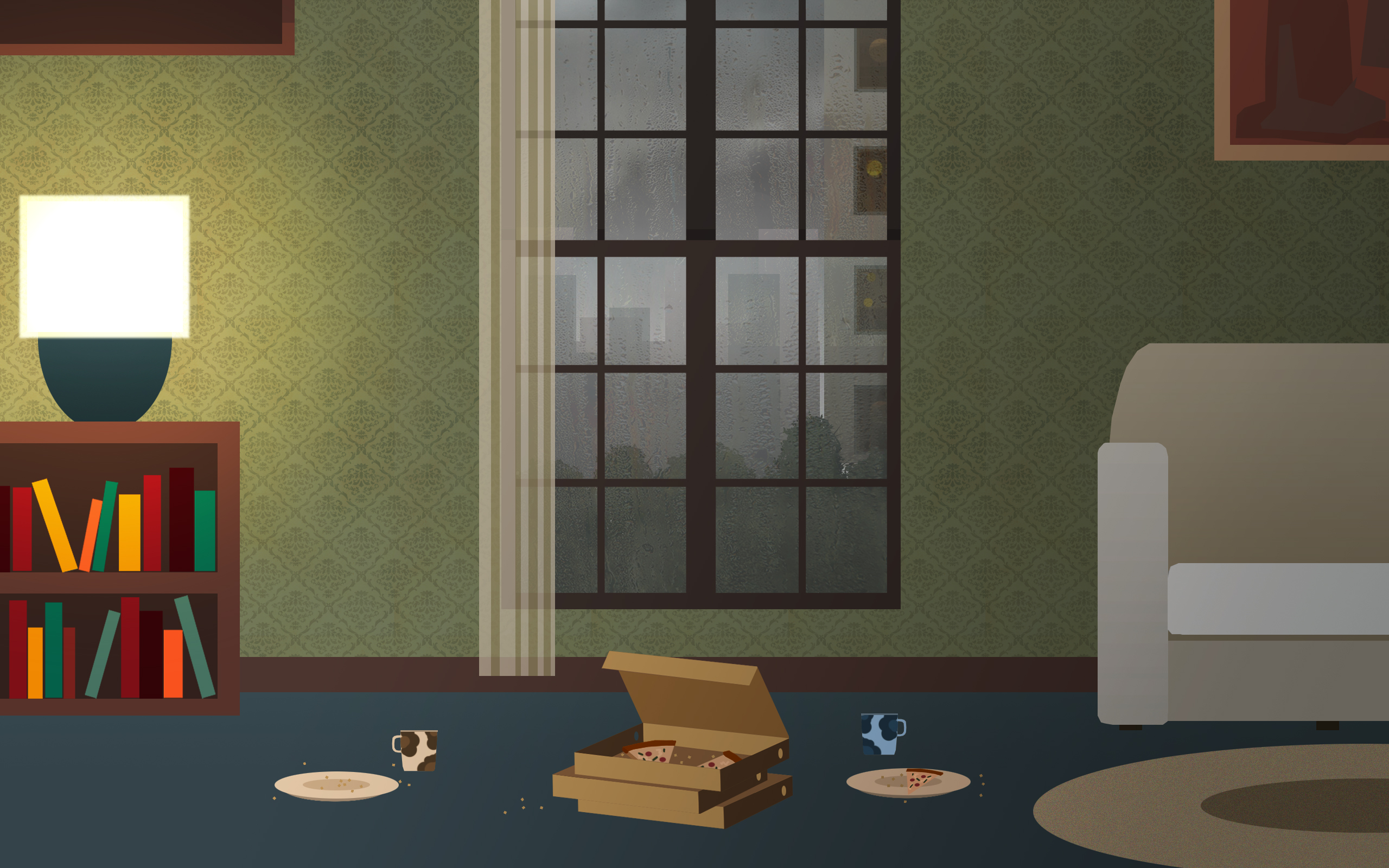
It's hard to talk a lot about all those things without spoiling the story, but luckily there's a bit of good art stuff to share this week as well. I've been trying to make improvements to the art, and have been experimenting with adding gradients and patterns to the walls for the interior scenes. Here's an example. I'm especially happy with how the frosty window and the rainy scene outside it turned out, it gives a really cozy feeling to the interiors - especially with the lamp, pizzas and coffees!

I also attempted to improve the character art for the game, with mixed results. Inspired by the character art style in Broken Age, I tried creating more detailed faces for the characters. Through polls on instagram and twitter, I realized that majority prefer the original character art style. What do you think? (New style is on the left, old on the right)

See you next week!
-Armaan
Get Rainswept
Rainswept
A murder mystery dealing with themes of love, relationships and unresolved trauma.
| Status | Released |
| Author | Frostwood Interactive |
| Genre | Adventure |
| Tags | 2D, Atmospheric, Crime, Detective, Mystery, Noir, Point & Click, Romance, Story Rich, Surreal |
| Accessibility | Subtitles |
More posts
- v1.1.5 - Full gamepad supportApr 16, 2019
- Fixes in v 1.1.4Mar 28, 2019
- Fixes in v1.1.3Mar 22, 2019
- Mac version has been rolled back and is playableMar 13, 2019
- v1.1.1 - Gamepad support + fixes in v1.1.2Mar 01, 2019
- Rainswept is OUT NOW on itch.io, 15% off for a week!Feb 20, 2019
- Overhauled controls!Feb 17, 2019
- Rainswept launches on itch.io on 19 February!Feb 13, 2019
- Rainswept is OUT NOW!!Feb 01, 2019
- Rainswept release date announcement!Jan 14, 2019

Comments
Log in with itch.io to leave a comment.
The interior textures came out really well! I can't decide on which character art style I like more. I like the new one on the left more, but I'm curious as to how it looks "in action" because of the possible facial expressions. As a detective, I think he should keep a button-down shirt with rolled up sleeves, though.
Thanks :) I'm thinking of trying to find a middle ground between the two styles, maybe keep the old eyes but add a gradient to the skin like in the new one. Also this isn't the detective, it's a different character.
Ah, yes, sorry for the mixup. And I totally agree with the direction you're heading by choosing a middle ground. Keep up the good work!
Thank you!